This animated infographic creator creates dynamically animated infographics that can be used in presentations and videos. Don't waste time searching for new charts and graphics. Create your own in just minutes! You will find nine charts and graphs as well as a set of icons, lower-thirds, titles, and maps. You can modify everything. You can change the color, line width, height, and roundness to create new designs. To achieve maximum results, you should make minimal effort.
The vertical chart can be easily modified. You can create as many charts as you like (up to 31), alter the number of columns, line widths, text size, color, and add or remove text. To make your chart lively and fun, you can turn on or off the middle line. Use the "blinds effect to create new designs for a column or whole chart. You can create new shapes by changing the left side point. To make your design more strict, reduce the radius.
This chart is clear and easily understood. You can compare the data using left and right side charts that have up to 12 rows. You can change the colors or apply a different color to each line. Blinds can be used to give your percent line a new look.
This chart can be used to create horizontal lines with up 12 lines. You can edit roundness and line width.
This graph can be used to create a perfect broken line. Add lines (max. Lines - 3 and a number of columns (up to 31) You can add points to complete the line. To give your chart a fresh look, you can change the color or adjust the width of the line.
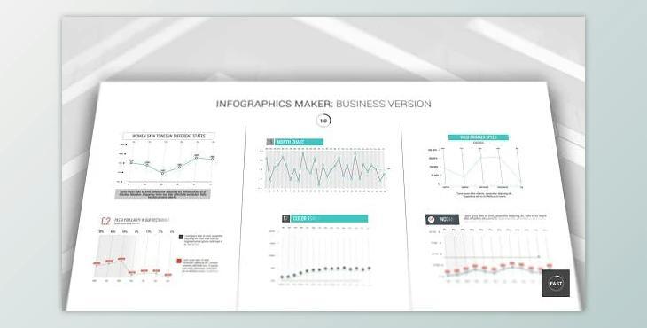
This graph can be styled with different colors. You can change the chart's radius and width. You can personalize the "blinds effect" to finish your graph.
This is a circle chart with three lines. You can arrange a color, width, and radius, as well as the size. To improve your chart, use a blinds effect
This graph can be styled with different colors. You can change the chart's radius and width. You can personalize the blinds effect to finish your graph.
This chart can be modified by adding three lines to it. You can also edit the colors or apply blinds.
You can create a variety of charts for each category. You can personalize the colors and icons to your liking. Blinds can be used to enhance a chart.
Blinds can be used to create a roundness or change the size.
You can use any of the 52 maps, and 10 design templates. You can also create your own maps by altering the color, size, icons, and blinds.
