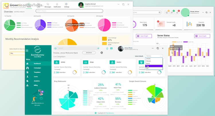
Bunifu UI WinForms redefines the landscape of desktop application development by offering a minimalist and modern design approach inspired by flat design principles. With a focus on simplicity, developers can effortlessly create visually stunning WinForms applications through intuitive drag-and-drop functionality and customizable controls. This framework provides a comprehensive suite of controls, from buttons and dropdowns to data grids and form components, empowering developers to streamline their workflows and deliver polished, user-friendly applications.
In addition to its aesthetic appeal, prioritizes performance by optimizing resource utilization without sacrificing functionality. Unlike heavier design frameworks, Bunifu UI WinForms ensures lightweight implementation, enhancing application responsiveness and user experience. Bunifu UI WinForms enables developers to create high-quality desktop applications that meet modern standards and exceed user expectations by offering a balance between design flexibility and performance efficiency.
Whether you're a seasoned developer looking to enhance your application's interface or a newcomer seeking to expedite the development process, Bunifu UI WinForms provides the tools and controls needed to accelerate development cycles and produce exceptional desktop applications. With Bunifu UI WinForms, developers can unlock their creativity and build sleek, efficient applications that resonate with users in today's fast-paced digital landscape.
Key Features of Bunifu UI WinForms :
- Selection: Allows users to choose or select items from a list or set of options.
- Button: Interactive elements that users click to perform actions or submit forms.
- Date Picker: Enables users to select dates from a calendar widget.
- Dropdown: Presents a list of options in a drop-down menu for users.
- Image Button: Buttons that display images or icons as their primary visual element.
- Picture Box: Displays images within a container for viewing or manipulation.
- Radio Button: Allows users to choose only one option from a predefined set of mutually exclusive options.
- Toggle Switch: Provides an on/off switch between two states.
- Tile Button: Buttons with a tile-like appearance, often used for navigation or as visual indicators.
- Tooltip: Displays additional information or context when users hover over or interact with specific elements.
- Layout: Tools for organizing and arranging user interface components within a window or form.
- Cards: Container elements for displaying related content or information visually appealingly.
- Separator: Horizontal or vertical lines used to separate content or components visually.
- Pages: Enables the creation of multi-page interfaces or wizards for step-by-step processes.
- Activity: Visual indicators such as spinners or progress bars to signify ongoing processes or loading states.
- Circle Progress: Circular progress indicators represent completion or progress visually.
- Gauge: Graphical representations of data values, often used to display metrics or measurements.
- Progress Bar: Linear indicators that show the progress of a task or process.
- Range: Controls for selecting a range of values, such as sliders or range selectors.
- Sliders: Allows users to adjust a value within a predefined range by dragging a slider handle.
- Track Bar: Similar to sliders but with a different visual presentation, often used for volume controls or seeking in media players.
- Vertical Trackbar: A track bar oriented vertically instead of horizontally.
- Data: Components for displaying and interacting with data, such as grids, labels, and text boxes.
- Data Grid: Tabular displays for organizing and presenting data in rows and columns.
- Label: Non-interactive text elements used for providing descriptions, titles, or captions.
- Rating: Enables users to provide feedback or rate items using a predefined scale.
- Text Box: Input fields for users to enter and edit text or alphanumeric data.
- Form: Provides the basic structure and functionality for creating windows or dialogs within an application.
- Gradient Panel: Container elements with gradient backgrounds for adding visual interest or emphasis.
- Shadow Panel: Panels with drop shadows for adding depth and visual separation within a layout.
- Scroll Bars: Controls for scrolling through content that exceeds the visible area of a window or container.
- User Control: Customizable, reusable components or controls created by developers for specific functionality or UI elements.

